The new Betterhalf
Redesigning the profile viewing experience
SYNOPSIS
About the project
Overview
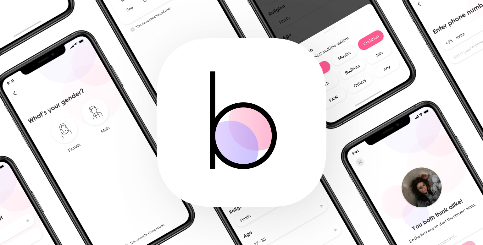
This design project was one of the major parts of the whole redesign process that we’ve done in Betterhalf.ai. Betterhalf is a matchmaking platform built for urban Indians. To elevate the experience of the app, we recently redesigned the whole app. This case study narrates the story about how we’ve improved our user engagement by redesigning the profile viewing experience of our mobile app.
Timeline
7 Weeks
My Role
Team Lead
Researcher
UI & Prototyping
Testing
Teammates
Prithvi Murahari
Ayush Bhamu
Shreeya Kadam
Shankar K
The problem
We’ve found that our user engagement rate was low even if we had a high customer acquisition. And through the help of the research and usability studies, we've seen a slight behavior change in our users while using the app.
The low acceptance rate of females.
Less number of connections are made.
The increasing amount of pending requests.
More time for decision making.
Solution
The solution is to improve the experience by introducing additional features, to tweak the engagement of the users, and to reframe the user flow to change the behavior of the users towards the app.
RESEARCH
Identifying the problems
Interview
We conducted telephone interviews with 12 of our users from different backgrounds. Most of them said that they were confused while taking a decision and they were not sure about connecting with all the potential matches. This actually reduced the chances for them to find their ideal life partner.
Usability studies
We conducted a semi-structured usability test to understand the behavior patterns of our users. The study was more focused on the decision-making patterns of the users and the information that they look for in every profile and their response towards some of our major features.
Online survey
The main motive of this survey was to find out the issues that the users are facing in general, to know their point of view on some of the features and their expectations from the product. This study helped us to get more data to drive design decisions like the priorities and the value of the features. It also helped us in finding the numbers.
RESEARCH INSIGHTS
Framing the problem
We brought together our individual research data and created a higher level theme in which the major challenges faced by our users.

Functional & Technical issues
Ignoring matches, declining a request, not possible to withdraw a request, UI limitations

General issues & Feature problems
Unnecessary features, non-serious profiles, social proof, verification, limited profile details, poor photos, non-active users, storytelling, compatibility, common interest, marital status

Psychological & Emotional problems
Profile comparison, decision making, expectations, personal bias, Time consumption
PROBLEM SYNTHESIS
Affinity diagraming
We used affinity mapping to get an in-depth analysis of the research data that we have collected. This method helped us in categorizing and prioritizing the data of the challenges the users faced.
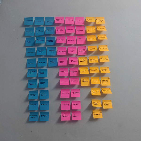
Listing affinity notes according to the issues
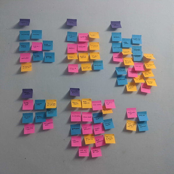
Categorizing affinity notes into different themes
USER PERSONA
Understanding the user
Personas really helped us to represent the user group who faced similar problems.

George Jacob, 32
Bangalore
George is an engineering manager who works for an enterprise company. He is looking for a life partner, and he wants to settle down within a year or so. He has used many dating and matrimonial products for this purpose, but he couldn't find someone there.
He doesn’t have any inclination or preference for his ideal life partner, which makes him clueless while searching for a partner. But he believes in the common interests, beliefs, and personalities of a person rather than attributes such as age, location, caste, religion, etc. His family too plays an important role, but he has the freedom to choose his life partner.
Ankitha Jain, 26
Delhi
Ankitha is a working professional, financially independent. She is single and looking for a life partner that she can settle down with and eventually get married. Ankitha has been in relationships earlier, has used dating apps before, and now looking for something that lasts forever.
Ankitha can get married in the next 2-3 years. She is very choosy and has a lot of preferences for her life partner. Her parents and family also play a very important role in finding a life partner. She does care about the attributes like age, location, caste, and mother tongue along with the interest and personality of her life partner.
BRAINSTORMING
Exploring ideas and opportunities
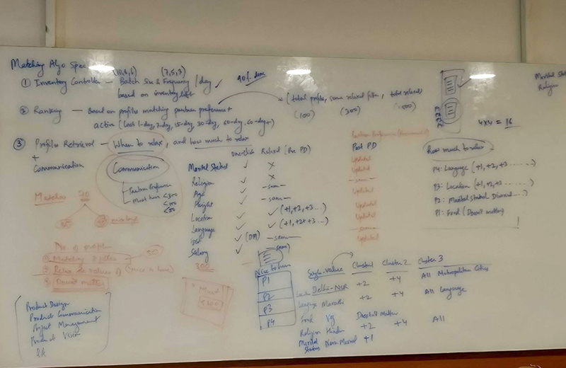
The main motive of this session was to dig deeper into the problem space and explore the opportunities. From the affinity diagram, we shortlisted and prioritized some of the issues and features, and while mapping them we have found out that some of the requirements are interconnected.
DESIGN DECISIONS
Rationale behind the solution
The brainstorming session helped us to decide on suitable solutions for our problems. We even decided on the features and functionalities that are going to be used.
Constraints
Solution
FLOW DIAGRAM
Mapping & organizing information
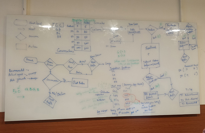
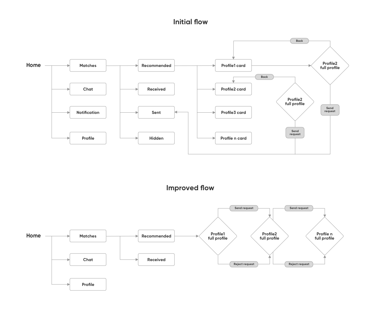
After deciding the solutions, we started sketching out the typical user journey. From there, we understood the flaws in the current task flow, and we’ve redesigned it.
WIREFRAMING
Low-fidelity explorations
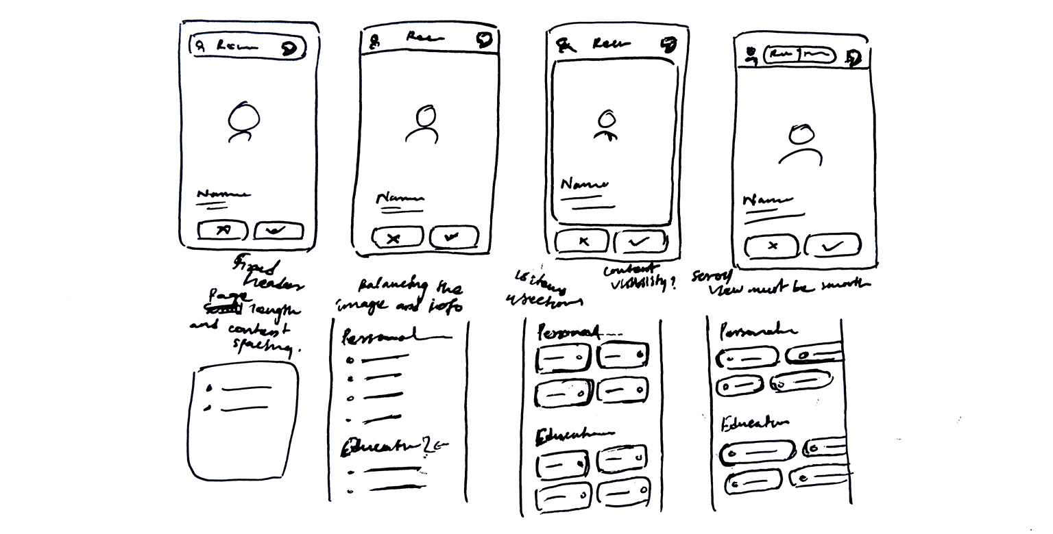
Based on the features and task flow, we created the initial sketches & wireframes to get final feedback from our stakeholders and users.
VISUAL DESIGNS
The final solution
Along with the redesign process, we also changed the visual identity of our whole product with the new style guides and principles.
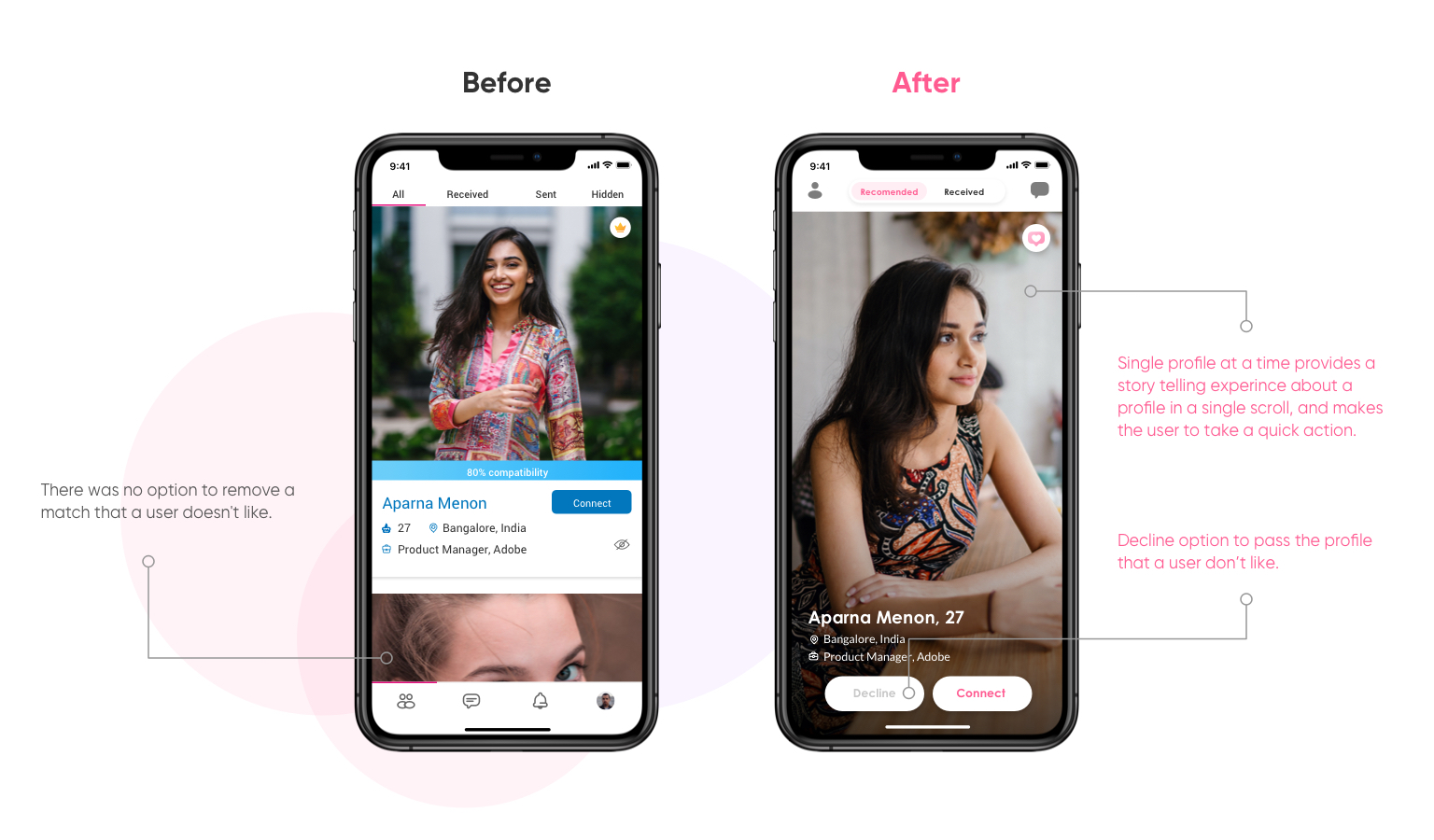
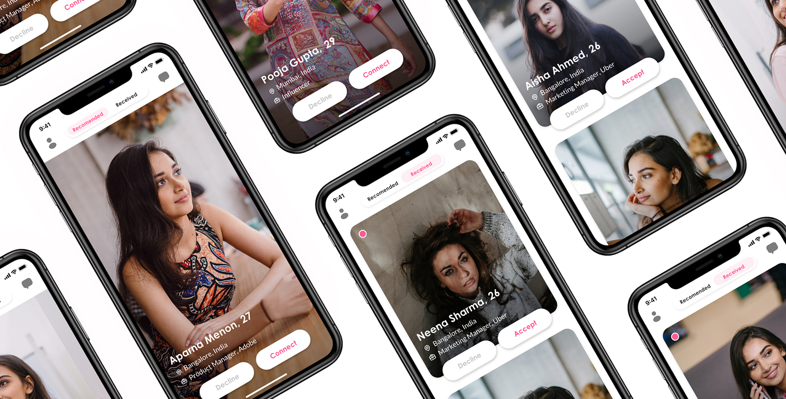
In the new home-screen, users can focus on a single profile and make a decision then and there. It also gives a storytelling experience for the user. With the introduction of the decline button, users can now pass a profile that they don't like.
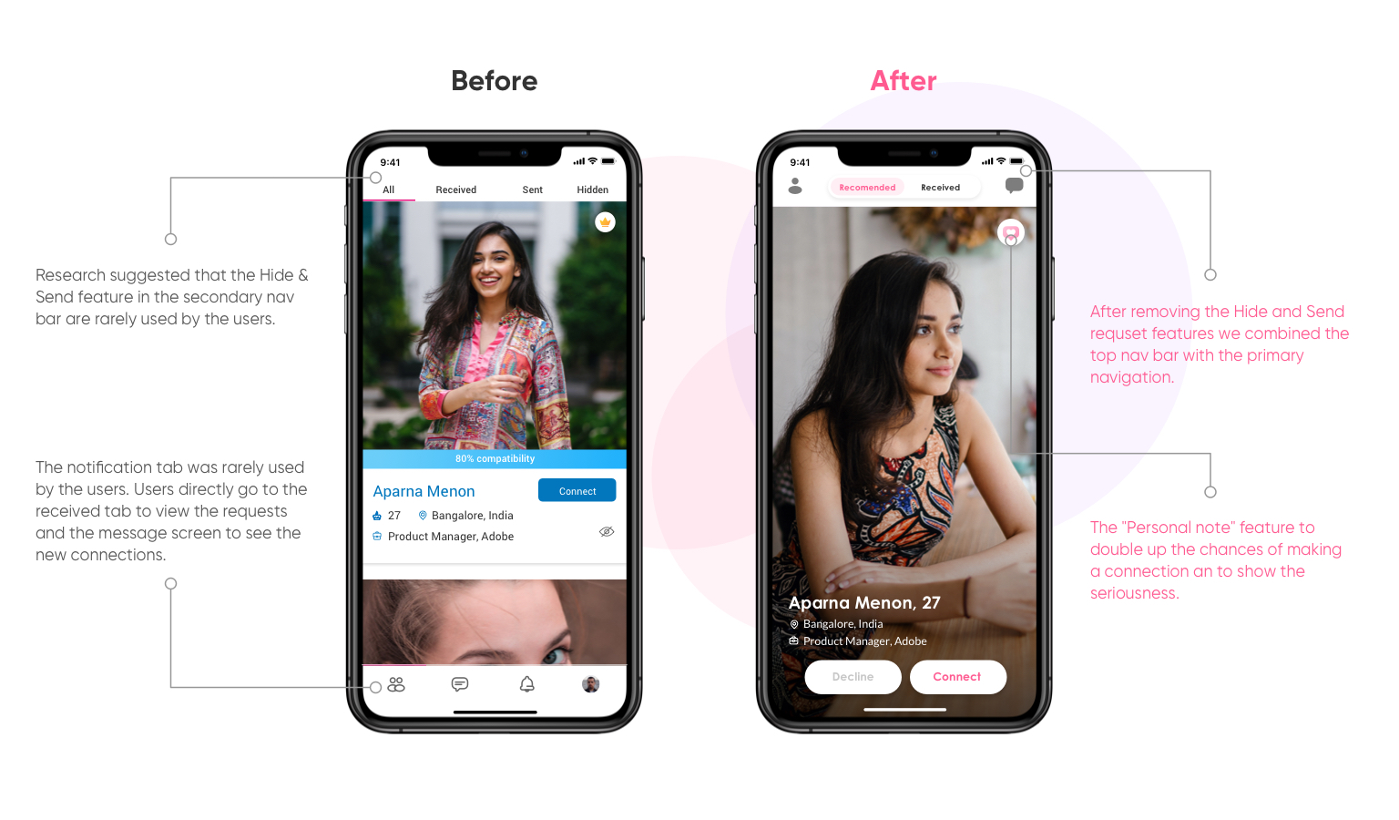
Combining the top nav bar and the primary navigation leads the users to focus on their recommended requests, received requests, and their connections. And the introduction of "Personal note" doubles the chances of making a connection by sending a brief note about the user along with the connection request.
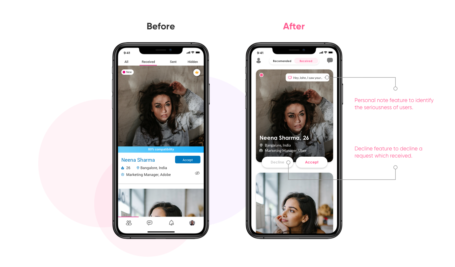
A simplified received request section with a decline button in every profile to reject a request. Also, the user can now differentiate the seriousness of a profile with the help of the personal note feature.
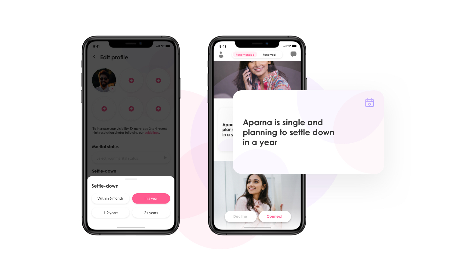
The settle-down feature plays an important role in the matchmaking industry. It not only defines the seriousness of the user but also helps a user to make it a top priority in their preference.
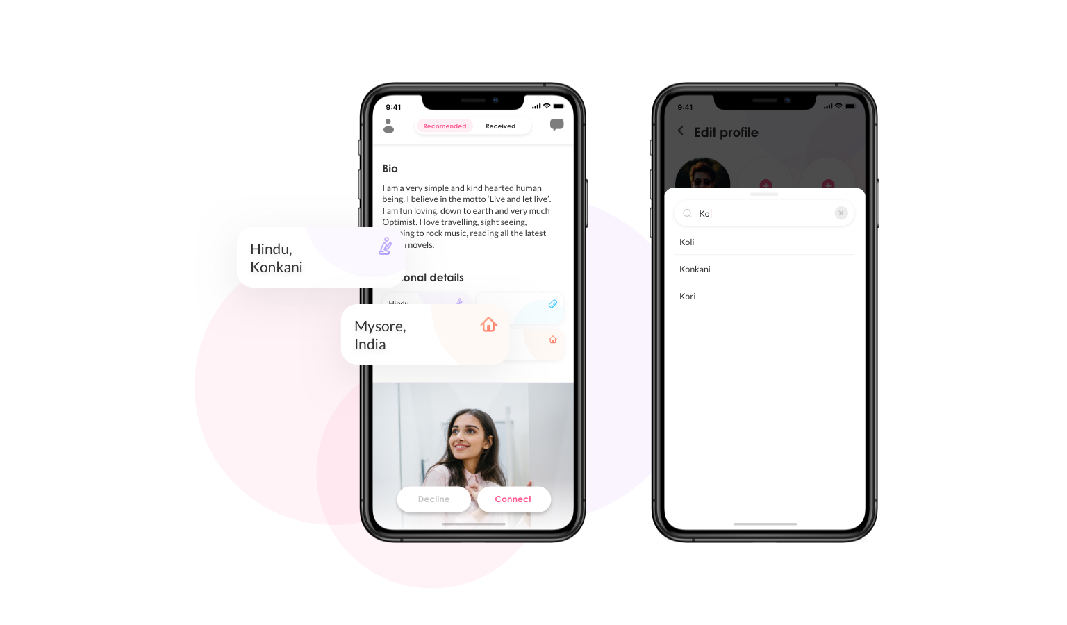
This was one of the most requested features at the time of our research, and it makes total sense to a typical Indian user whose family members will also be part of choosing the life partner.
CONCLUSION
Reflection and next steps
Due to the time constraints, we only worked on the major features that we have prioritized. And we planned some of the remaining features for phase 2 - it includes, Photo verification, Personality & Compatibility section, Connection & Request expiry, Profile shortlist.
NUMBERS
The success metrics
After launching the redesigned app we’ve seen a huge leap on the key metrics that we tried to improve. Following are some of them.
Total connections made
Total Request sent
Acceptance rate of female users
Pending matches
Pending requests
LEARNINGS
Takeaways from the project
While working on this project I had a great experience to practice my teamwork, collaboration, and accountability skills. I learned that dividing the workload and owning a part of the project is key to productivity. Also, I was once again reassured that user testing and iteration will always deliver positive results.
Additional Discussion
Points which are not covered in this case study but could be share worth sharing in person
Design alternatives
User testing & evaluation
Design challenges
