Finding the better-self
Rebranding story of Betterhalf
SYNOPSIS
About the project
Overview
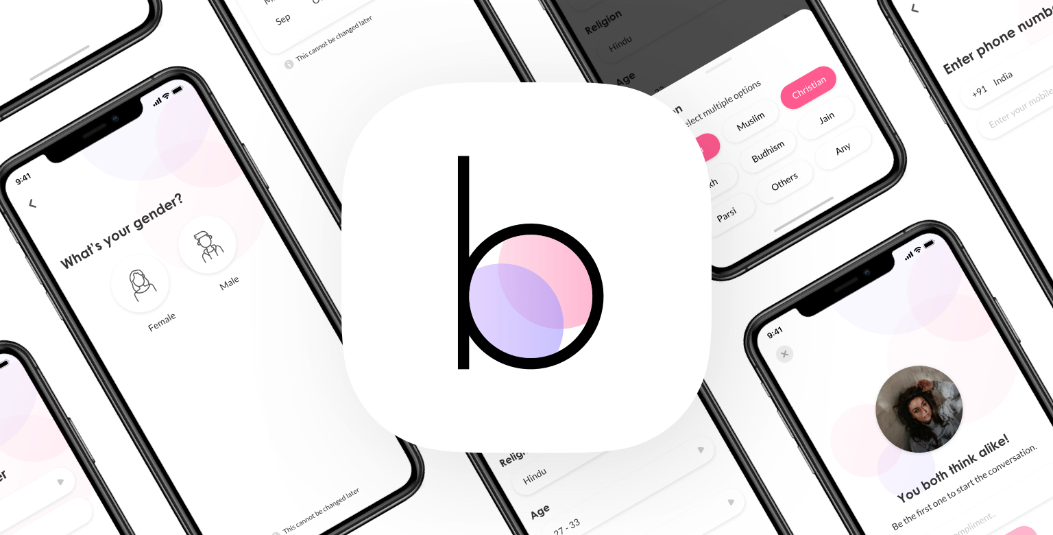
Finding the better-self - The story of how Bettehalf rebranded the whole product to reposition the brand and to compete at a higher level in the market by improving the brand identity, communication, and its core attributes.
Timeline
8 Weeks
My Role
Researcher
Brand designer
Interaction design
Teammates
Prithvi Murahari
Ayush Bhamu
Shreeya Kadam
Jasmine Bano
The challenge
Betterhalf is a serious matchmaking product build for urban Indians who are looking for a life partner. The changes and growth that have taken place at betterhalf have affected the communication and the personality of our brand. It no longer reflects who it is. So the challenge was to reposition the brand by improving brand communication and its core attributes.
A NEW IDENTITY
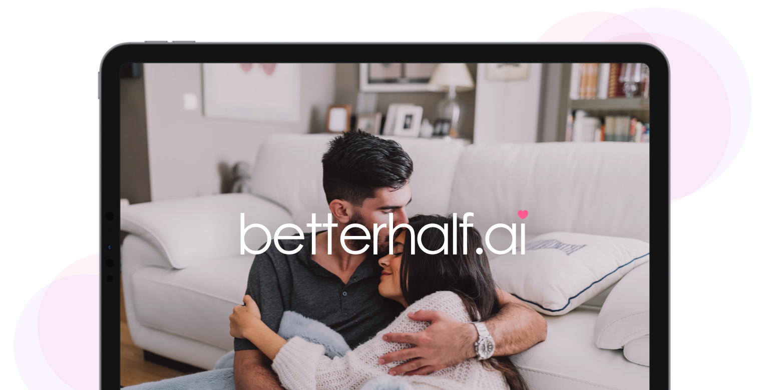
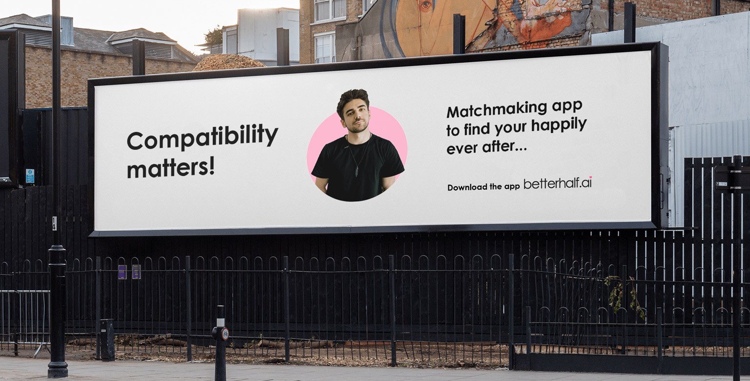
The new Betterhalf
ABOUT BETTERHALF
The matchmaking app
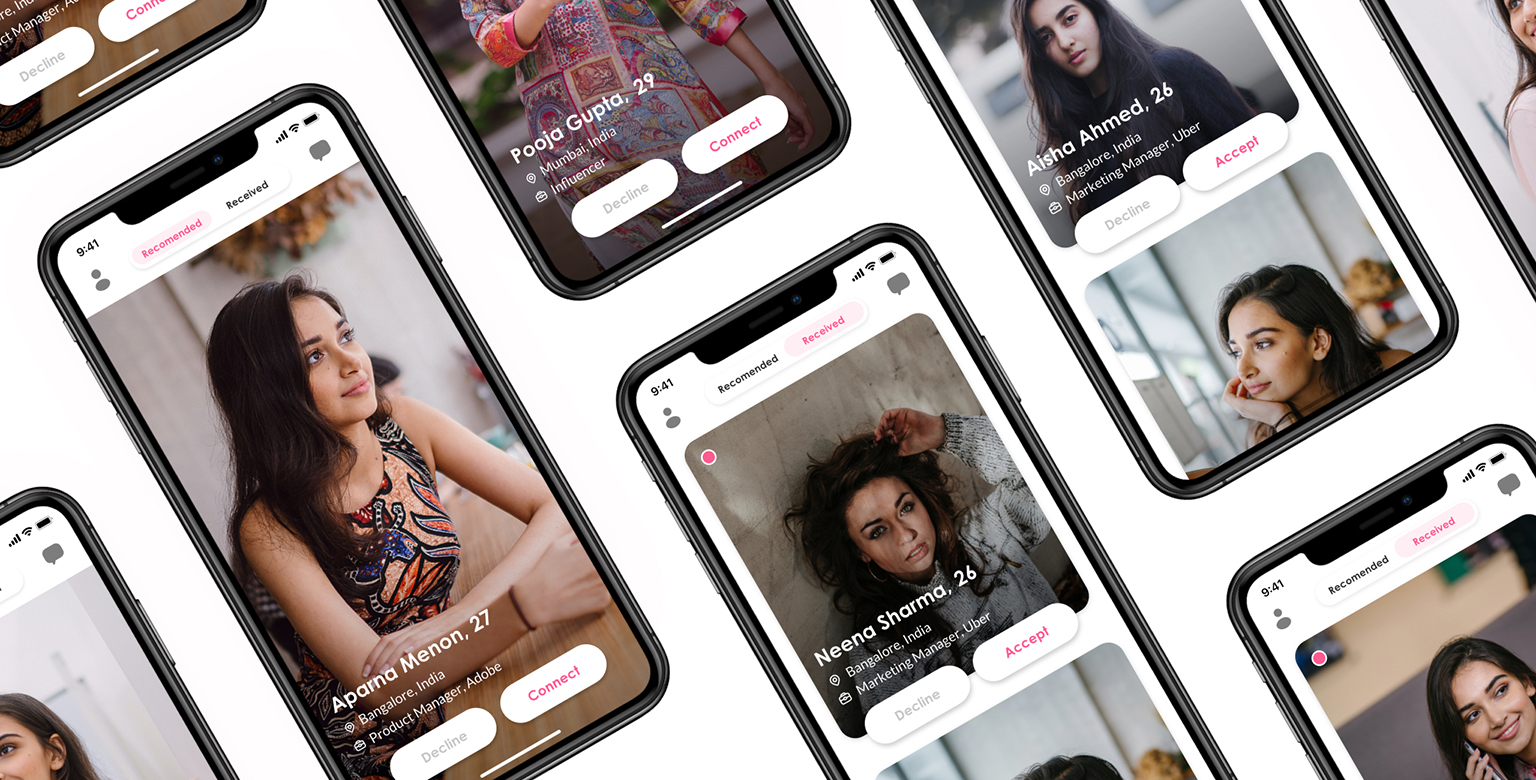
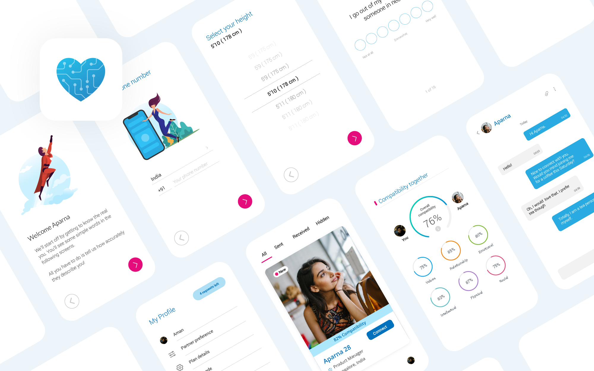
Betterhalf is a serious matchmaking product for working professionals looking for a life partner. Betterhalf uses artificial intelligence and predictive analysis to help people find a good match. Through compatibility scores based on multiple relationship dimensions and users’ interactions with the product, Betterhalf tries to streamline the partner search.
WHY REBRANDING?
The miscommunication
A brand is a perception consumer has of a business and those perceptions originate from the story we tell about our product. And the story includes the positioning, the consumer benefit, the personality, the aspiration, and the emotions. But in Betterhalf, the brand communication was not clear to our users due to the lack of personality and positioning of our brand.
Also at Betterhalf we love changes and improvements, but it led us to a different perception among the users. The changes and growth that have taken place has affected the communication and the personality of our brand.
The current brand no longer reflects who we are
To simplify and focus our message
Repositioning ourself
To compete at a higher level in the market
THE PROCESS
The brand development process
The plan to redesign the whole product was actually going on for the past few weeks before we even think about the rebranding. So we took a step back and dig deeper into the implications of a product redesign, and that actually led us to the brand issues. As we dived deeper into the problems we’ve realized there is a need for a new brand voice, but it also meant we need a new color palette, new logo, new guidelines altogether.
Started from the core
As a company, Betterhalf has had a clearly defined mission and the values. But users mostly care about the personality rather than values, why because a person’s personality is on display all the time. So we started from there, the personality of better-half according to our users, stakeholders, and the team.

Firm research
We talked extensively to our management team and other executives to understand how they perceived the firm’s strengths, weaknesses, and value propositions. It helped us to set a base for our research.

Insights
The research helped us to set a base for our other studies. Also, it helped us to understand brand perception from the management side.

User research
We conducted interviews with a few of our users to gain a critical perspective of the product. From the interview, we have found that our users had a lot of expectations from an AI-based company. They even build up some unrealistic stories that we have never stated before.

Insights
The study helped us to know the story of our users and their misconceptions about our brand.

Competitor research
We then reviewed our competitors to identify their brand identity, positioning, and communication. This research helped us to understand the opportunities in the market and what our competitors are doing uniquely with their products and services.

Insights
This helped us to figure out the differentiation points of our product and the opportunities to grow in the market.
Hands-on
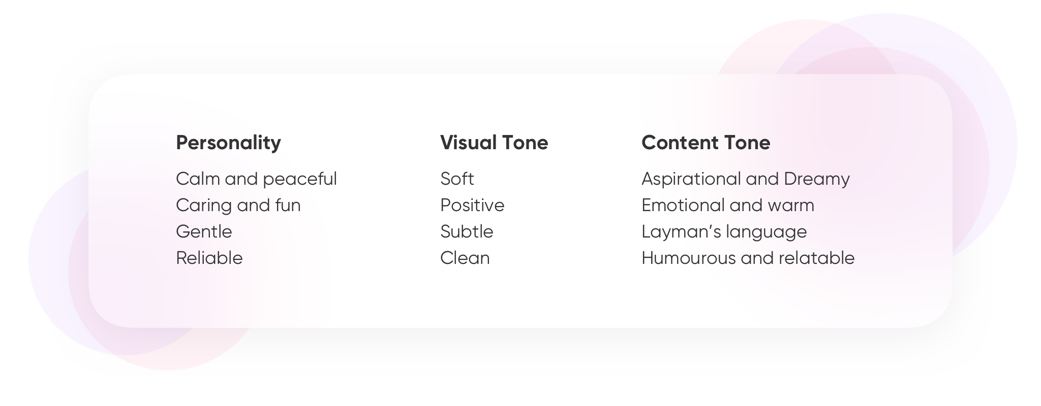
After getting the research insights, we started to connect the dots - started with finding out the brand attributes. We involved our teammates on this process and got a diverse set of insights from it. And this is how the attributes look like after we narrowed it down to four.
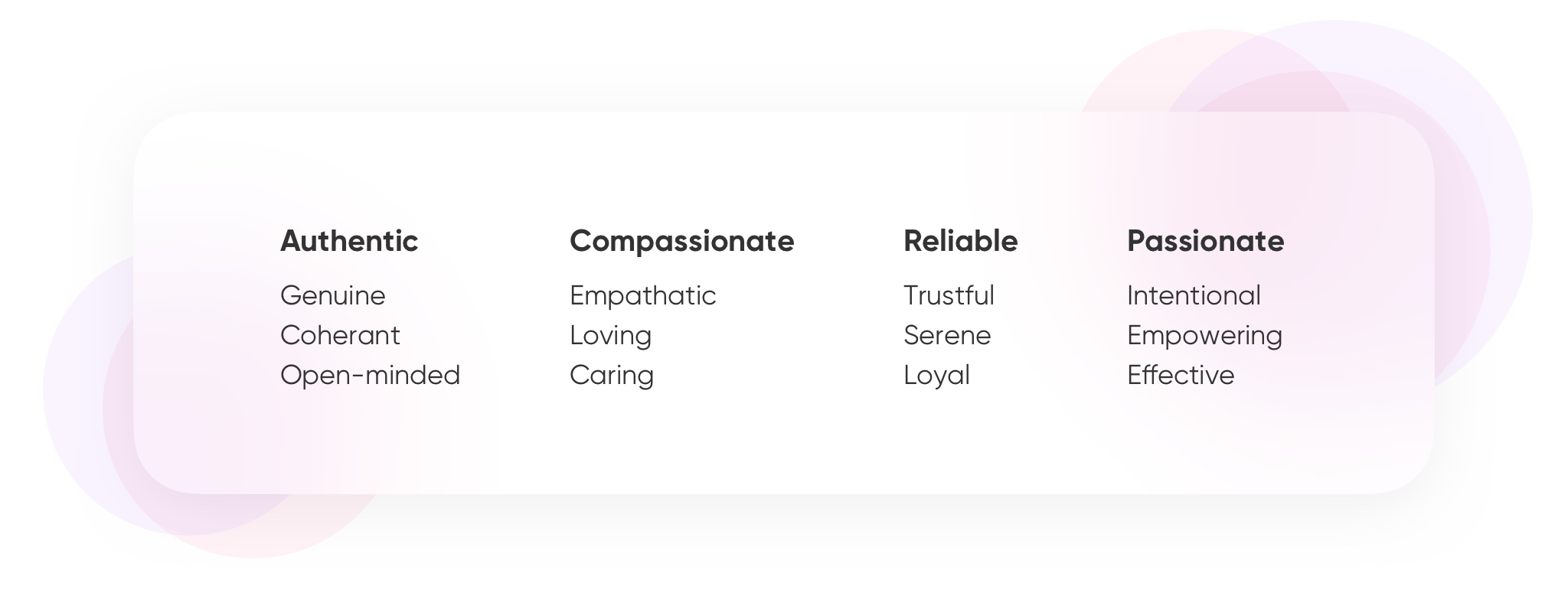
We set a brand voice to communicate and to bring our story to life and create the tone of our brand. We wanted to position ourselves as a companion in our users’ journey, who helps them to find their life partner. And that’s what we reflected in our tagline - “A journey to find your forever”.
Visual designs
The translation of our brand philosophy into design started with the logo. Our old logo represents a story the we have used as our slogan - ‘Our AI finds your life-partner’ - the combination of heart and tech.


In the new branding, we wanted to remove the entire tech attribute while communicating so that’s the major reason behind the logo change.
After creating the mood-board and brainstorming with the team, we proposed three logo directions which reflected the values and personality of our brand.
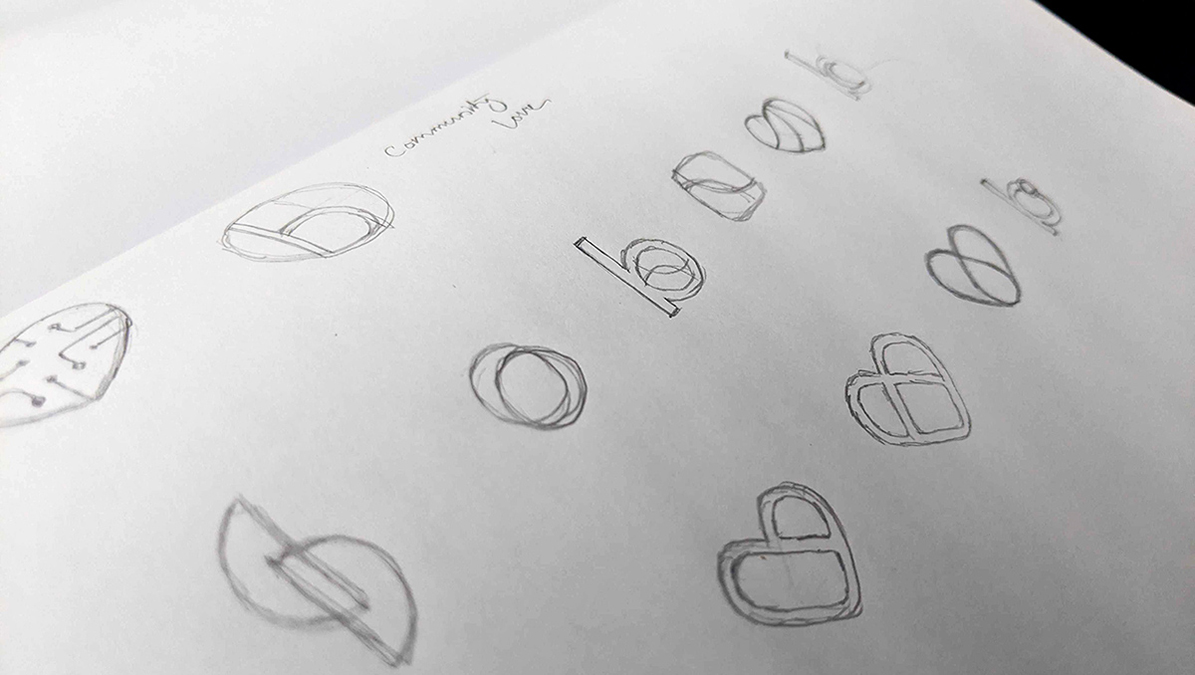

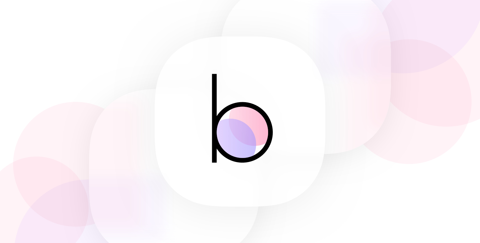
Among these, our team liked the second one. The icon is an abstraction of three principles - connection, community, and love - that have been blended into a single small letter ‘b’ shape. The logogram is designed after the brand idea of ‘connection’.


Creating the system
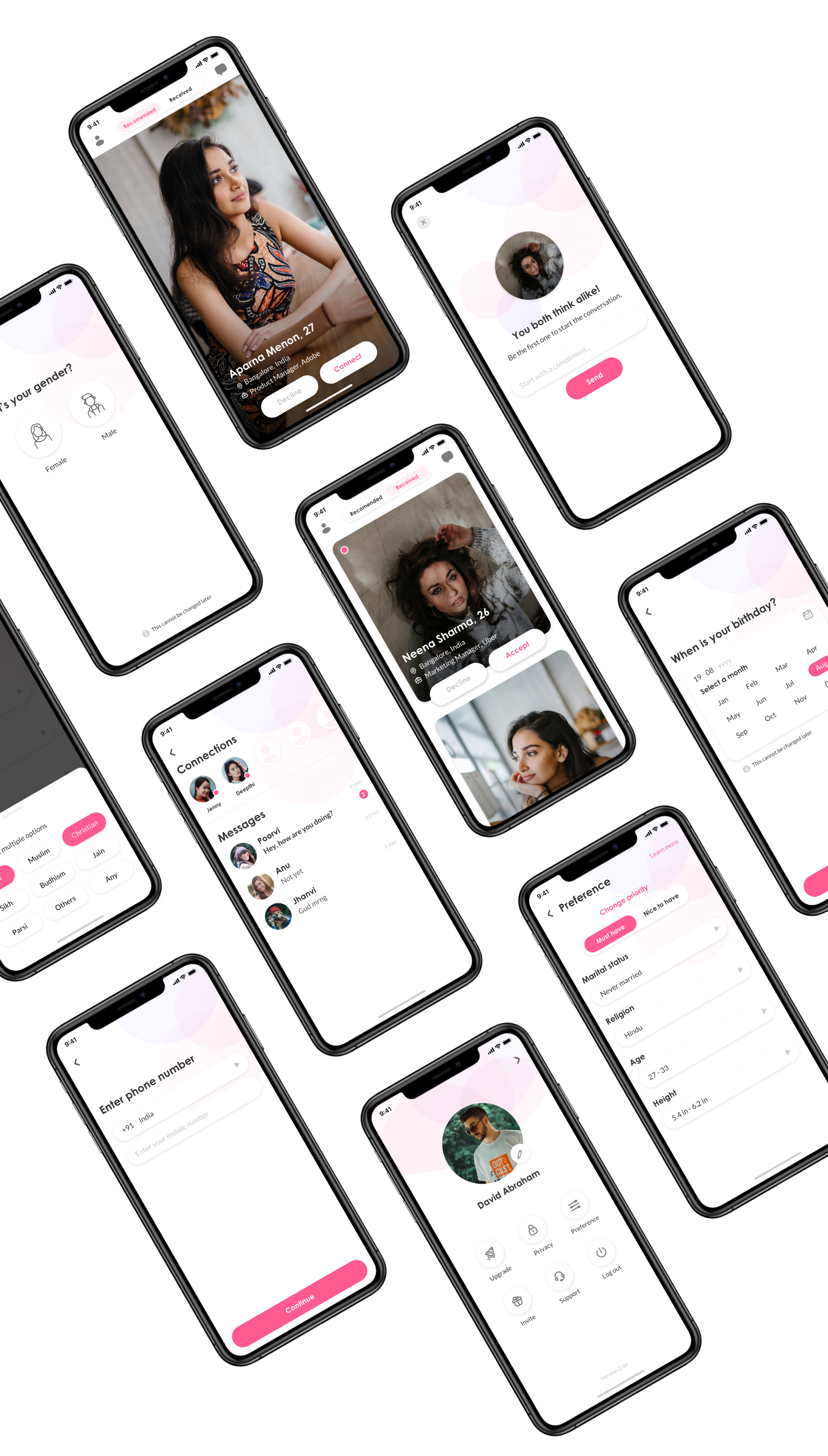
Setting the visual rules and principles really helped us to maintain order and consistency. This also helped us to elevate the experience, and increase the speed and efficiency of the internal team. The system includes the colors, typography, icons, components, photos, etc.


The new system was inspired by the personality of our product - Calm and Peaceful. We believe that the core of a relationship relies on the key things like peace and sensitive behavior of the people. And we used similar behavior for our product as well.
NUMBERS
The success metrics
The users engagement rate
Rise in App downloads
Rise in user acquisition
LEARNINGS
Takeaways from the project
Involve your team members in branding as early as possible.
Encourage experiments and innovations.
There should be a strong reason for rebranding.
Focus on the core problem rather than just redesign the logo and the guidelines.
There’s nothing you can do to keep your brand from being adopted by an unintended target audience.
